
 1.866.458.6999
Key Takeaways
- Keep your ID card design simple so key details like the name, photo, and role are easy to see at a glance.
- Use a clear, high-quality photo and a readable font to improve employee ID card identification.
- Include your organization’s name and logo to strengthen branding and help return lost ID cards.
- Choose background colours that improve contrast and keep your ID cards professional and easy to read.
- Design with card holders and lanyards in mind so your ID cards stay clear and usable in everyday settings.
A well-designed ID card helps employees, visitors, and security personnel identify people quickly, reinforces your organization’s brand, supports workplace security, and can even integrate with electronic access control systems. Your ID card represents your brand, enforces internal company policies, and forms the foundational front line of your physical security system. A rushed design can result in vital details being unreadable, security functions failing at the end-use point of view, or cards wearing out prematurely.
Designing effective ID cards requires balancing visual clarity, internal security features, organization branding, and everyday usability. These ID card printing design tips from Avon Security Products will help you create professional, secure, and highly visible badges that ensure your team can instantly verify identities and prevent security breaches, saving your organization from costly security errors.
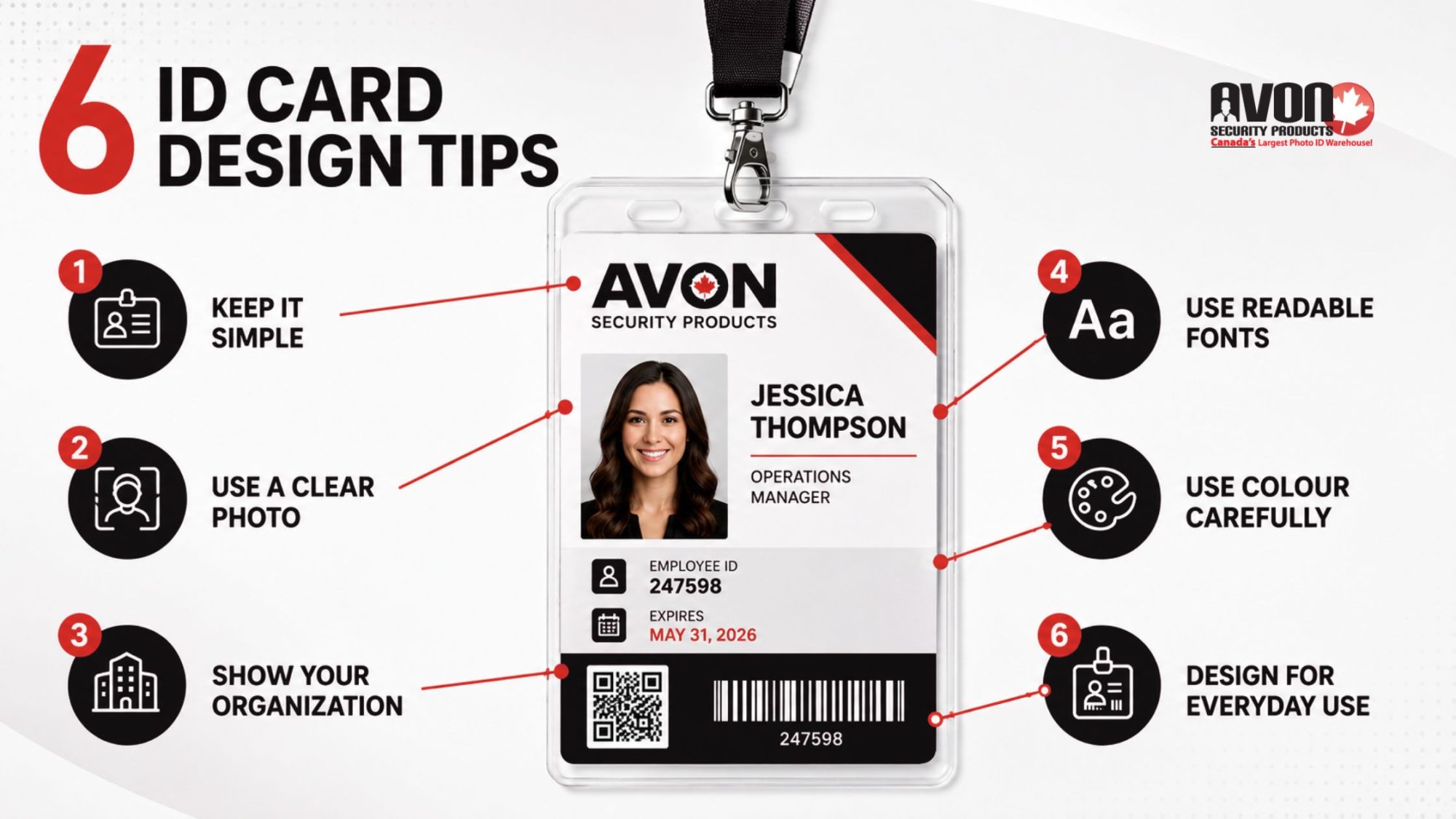
Tip 1: Keep It Simple
An employee ID card often needs to communicate important information in seconds. Whether someone is entering a secure building, checking in a visitor, identifying staff during an emergency, or verifying credentials, every detail should be easy to locate at a glance. A clean design layout improves visual recognition, reduces mistakes, and helps your security system work more efficiently.
Rather than trying to fit every employee detail onto the card, prioritize only the vital information someone needs to identify the cardholder quickly. In most organizations, the must-have specifications include:
- A recent photograph
- Employee name
- Job title or department
- Organization name and organization logo
- Expiry date
- Employee ID number, barcode, or QR code (when applicable)
Organize these key features using a clear visual hierarchy so the photograph, name, and company branding are immediately recognizable. Supporting details should complement the design, not compete for attention.
Avoid overcrowding the card with unnecessary illustrations, excessive text, or decorative colours that make it hard to scan for the most important information easily. Likewise, leaving too much information sparse can make the design feel unfinished and unprofessional. The goal is a layout that is both readable and clear, giving security personnel, reception staff, and employees confidence that important details can be found instantly.
Tip 2: Use a Large, Clear Image
Your photograph is the single most important element on any photo ID card. If the image is difficult to recognize, outdated, or poor quality, the card becomes far less effective for identification, regardless of the security technology built into it.
For the strongest visual recognition, use a large photo size that clearly shows the employee’s face. Every image should be well-exposed, in focus, and captured against a plain, light-coloured background or white or a light background colour to eliminate distractions and improve contrast. Following baseline Western ONECard Photo Standards ensures that the profile image is sharp and free from obstructive filters. Consistent photo placement across every card also creates a more professional appearance while making identification quicker for security staff.
For professional printing, photographs should be prepared at 300dpi resolution to maintain image quality. If logos or artwork are supplied separately, providing an Illustrator file (.ai) or Photoshop file (.psd) ensures branding elements remain sharp during production.
Many organizations also combine high-quality photographs with advanced security features, including barcodes and QR codes, magnetic stripe encoding, smartcard technology, holographic foil, or watermarks. When paired with a reliable data capture program or access control system, these technologies transform a simple photo ID into a secure credential that supports both identification and controlled building access.
Tip 3: Include the Name of the Organization
An ID card should instantly communicate who issued it. Clearly displaying the organization name and organization logo establishes authenticity, strengthens your brand, and helps distinguish authorized employees from visitors or contractors.
Strong branding elements also make day-to-day operations easier. Reception staff, security personnel, and other stakeholders can immediately identify employees, while professionally branded name badges reinforce confidence with customers, patients, students, and visitors.
Building Trust at First Glance
Beyond appearance, organizational branding plays an important role in workplace security. Clear company identification helps support internal company policies, simplifies information handling procedures, and improves the likelihood that lost cards are returned rather than discarded.
Organizations that issue secure credentials should also consider how the card supports their broader security system, balancing visibility with the privacy of information displayed. This is particularly vital in highly sensitive environments, matching the mandatory criteria outlined in the Professional Appearance and Photo Identification Badges Policy. Depending on your workplace, that may mean limiting personal details on the front of the card while reserving additional information for secure databases or encoded technologies.
Tip 4: Use a Suitable Font
Prioritize Readability in Every Environment
Employee ID cards are designed for quick identification. Every name, job title, and access credential should be easy to read at a glance, allowing security personnel and employees to verify identities quickly and confidently. Choosing the right typography improves usability, reduces identification errors, and supports a more efficient security process.
When selecting fonts for your ID card design, keep these best practices in mind:
- Choose a sans-serif font. Clean, modern sans-serif typefaces remain the most readable option for employee ID cards and name badges, especially when viewed from a distance or under different lighting conditions.
- Use capital letters strategically. Reserve capital letters or ALL CAPS for key details such as employee surnames, department names, or access levels. Overusing all caps can reduce readability, so use them only where they improve recognition.
- Create strong contrast. Text in classic black or other readable dark tones stands out best against lighter backgrounds, helping employees and security personnel locate vital information quickly.
- Avoid decorative fonts and italics. Script fonts and excessive italics may look attractive on screen but often become difficult to read once printed at card size.
Consistent typography across every credential also creates a more professional appearance while making it easier for security teams to verify identities quickly. If you’re producing cards across multiple departments or locations, creating standardized templates within your ID card software helps ensure every card follows the same design standards and supports your organization’s branding and security policies.
Tip 5: Choose the Background Colour Carefully
Improve Visibility Without Sacrificing Your Brand
Background colour affects how quickly information can be read, how easily photographs can be recognized, and how effectively your security team can identify employees from a distance.
For most employee ID cards, a white or a light background colour behind the photograph and text provides the best readability. A plain, light-coloured background creates strong contrast with classic black or other dark text, ensuring names, job titles, expiry dates, and other vital information remain highly visible. By comparison, a background that is too dark or heavily patterned can reduce legibility and make important details harder to verify.
Background colours can also support your organization’s day-to-day operations. Many businesses use different colours to designate different levels of access, departments, contractors, visitors, or temporary credentials. This simple visual cue allows reception staff and security personnel to identify card types immediately without relying solely on printed text, matching institutional standards such as the Commissioner’s Directive on Identification Cards.
When incorporating your corporate colours, use them thoughtfully. Position branding around headers, footers, or logos while preserving a light background behind the employee’s photograph and text. This approach balances professional branding with the essential security specifications needed for quick identification, mirroring the official layout frameworks detailed in the Personnel Identification Design Standard.
Tip 6: Consider Everyday Use
Designing an employee ID card involves more than choosing colours and layouts. Before sending artwork to print, review how the finished credential will be displayed, scanned, and used throughout your workplace. A few production checks can help avoid costly reprints while ensuring important information remains visible under general Government Security Policies.
Many organizations issue credentials with ID card holders, lanyards, badge reels, or clips. These accessories should never cover employee information or branding.
Before printing ID cards, check that:
White space along the border allows room for slot punches and holders.
Artwork doesn’t run right to the edge, where logos or text may become obscured.
The employee photo, organization logo, name, and expiry date remain fully visible once the card is inside its holder.
Access Control Compatibility
If your cards support building access, the layout should also accommodate the technology inside the credential.
Review the following before production:
- Position barcodes and QR codes where they can be scanned easily.
- Follow manufacturer recommendations for magnetic stripe encoding, RFID, or smartcard technology.
- Verify that slot punch placement won’t interfere with the card’s activation method or other security functions.
Print a Sample First
Always review a printed sample before approving the full production run. Confirm that text remains easy to read, and photographs are printed clearly. Check that names, photographs, and expiry dates remain visible once the card is placed in its holder, and confirm that barcodes, QR codes, or other security features scan correctly.
Catching small issues before production can help avoid unnecessary reprints and ensure every credential is ready for daily use.
Take Control of Your Security with Customized ID Cards
Investing time into developing a thoughtful, professional ID card design layout directly protects the physical security and operational efficiency of your organization. By prioritizing simple layouts, strong contrast, clear typography, and practical card holder compatibility, you transform a basic piece of plastic into a powerful asset for your business.
Ready to streamline your badge production, configure cutting-edge ID card software, or discover the perfect photo ID system for your facility? Reach out to the Avon Security Products team today to explore how we can assist you in designing and streamlining your ID card solutions, ensuring enhanced security and efficiency for your organization.
FAQs
What background colour works best for ID cards with photos and text?
A plain, light-coloured background, ideally white or a very light neutral, delivers the strongest contrast for photographs and text, keeping names, job titles, expiry dates, and other vital information highly visible at a glance. A background that is too dark or heavily patterned reduces legibility and makes essential security specifications harder to verify, especially from a distance or under variable lighting. Use corporate colours around headers, footers, or logos while preserving a light background behind the photo and key details, and leave white space along the border so artwork doesn’t run right to the edge.
How do I choose fonts that stay readable on small ID cards?
Choose clean, modern sans-serif fonts for employee ID cards because they remain readable and clear at small sizes and under different lighting conditions. Use capital letters strategically; reserve all caps or ALL CAPS for surnames, department names, or access levels rather than setting all text in capitals, which can reduce readability. Ensure strong contrast with classic black or other readable dark tones on light backgrounds, and avoid decorative fonts and excessive italics that become difficult to read once printed. Consistent typography across templates supports your organization’s branding and security system.
What image resolution and file formats should I use for ID card photos and logos?
For professional in-house production, prepare employee photographs at 300dpi resolution to maintain sharpness on a large photo size and avoid pixelation. Supply logos and artwork as vector or high-resolution raster files, an Illustrator file (.ai) or Photoshop file (.psd), so branding elements and logos remain crisp during printing. Photos should be well-exposed, in focus, and captured against a plain, light-coloured background to improve contrast and visual recognition, with consistent photo placement across every card for a professional photo ID system.
How can I use colour to indicate access levels without hurting readability?
Many organizations use different colours to designate different levels of access, departments, contractors, or temporary credentials as a quick visual cue for reception and security teams. Apply colour coding to borders, bands, or background accents while keeping the area behind the photo and text on a white or light background colour so vital information stays highly visible. Avoid a background that is too dark or busy, and pair colour cues with clear text labels (for example, “Contractor,” “Visitor”) so essential security specifications remain readable and clear.
Which security features should I consider beyond the photo and barcode?
Beyond photographs and barcodes and QR codes, modern credentials can include holographic foil, watermarks, UV ink, microprint, magnetic stripe encoding, and smartcard technology to deter counterfeiting and tampering. Overt features like holographic elements are visible for quick checks, while covert features such as UV threads require a UV lamp and support your data capture program or security system. For high-security environments, consider encrypted RFID or contact smart chips that support secure, contactless access, layered with other security features for a robust photo ID system.
How do I ensure barcodes and QR codes scan reliably on ID cards?
Position barcodes and QR codes where they can be scanned easily by your data capture program, mobile capture system, or access readers without obstruction from ID card holders, clips, or lamination. Follow manufacturer recommendations for size, quiet zones (white space around the code), and placement to avoid scanning errors in your electronic access cards or photo ID system. Test printed samples with your actual scanners before full distribution, and avoid placing codes too close to edges or slot punches where artwork might run right to the edge and distort the pattern.
What layout mistakes make ID cards harder to use in holders and lanyards?
Common mistakes include letting artwork run right to the edge, which can hide logos, company name, or vital details once the card is punched and placed in ID card holders. Failing to leave white space along the border for slot punches can obscure the photograph, organization logo, name, or expiry date at the end-use point of view. Overcrowding the design layout with too many illustrations or dense text reduces scannability, while overly sparse information can look unprofessional and waste space needed for must-have specifications and key features.
How much information should I put on the front versus the back of an ID card?
Prioritize sparse information on the front: a recent photograph, employee name, job title or department, organization name and organization logo, expiry date, and an ID number or code when applicable. Use the back for secondary details such as emergency contacts, access instructions, or privacy notices to keep the front readable and clear for quick visual recognition. Limiting personal data on the front supports privacy of information while still meeting essential security specifications, and aligns with internal company policies and information handling procedures for your security system.
How do I align ID card design with my organization’s branding and policies?
Clearly display the organization name and organization logo on every credential to establish authenticity, strengthen brand recognition, and support your security system. Standardize typography, colours, and design layout across departments so name badges and access cards look consistent and professional for all stakeholders. Align the card with internal company policies and information handling procedures: for example, by limiting personal details on the front and encoding sensitive data instead, to meet essential security specifications and company policies while reinforcing organizational branding.
What accessibility considerations matter for ID card colour and contrast?
Badge colour contrast is critical for real-world readability, especially for people with reduced vision or colour perception. Aim for high contrast between text and background, ideally meeting or exceeding a 4.5:1 ratio for normal text and 3:1 for large text, so names, job titles, and vital details are easy to read at arm’s length. Avoid relying solely on colours to convey meaning (for example, access level) without supporting text labels, and test designs under typical workplace lighting to ensure your photo ID system is highly visible and inclusive.
How do I design ID cards that comply with Canadian privacy expectations for employee data?
Design ID cards to minimize personal information on the front, showing only what’s needed for quick visual recognition: photo, name, job title, organization name and logo, expiry date, and ID number or code. Under PIPEDA, limit collection and use of personal information to identified purposes, and avoid displaying sensitive data (home address, birth date, etc.) on the card itself. Store additional details in secure databases or encoded technologies, and document your information handling procedures and retention schedules to meet accountability, safeguards, and limiting-use principles for your security system.
What are best practices for reissuing and expiring ID cards without disrupting access?
Establish a clear policy that defines who gets cards, what access levels they grant, how long they’re valid, and what happens when cards are lost, stolen, or expired. Use a centralized credential management system to track issuance, monitor access activity, and automatically deactivate or reissue cards when roles change or expiry dates arrive. For printed cards with individual identity information, collect and destroy old credentials; for unprinted access cards, deactivate and reuse them after sanitization, combining visual photo ID with role-based permissions and regular access audits to maintain security without interrupting legitimate access.